Featured
African American Political Thought: A Collected History
by Katherine Preston
by Katherine Preston

Get future issues or buy back issues.
Make a tax-deductible donation today and help us continue to publish online and in print. No contribution is too small.

Published by Princeton Architectural Press, 2010 | 272 pages
“How do you draw time?” Daniel Rosenberg and Anthony Grafton ask in opening their history of the timeline, Cartographies of Time. We can hardly speak of time without spatializing it: “Tomorrow, and tomorrow, and tomorrow, / Creeps in this petty pace from day to day,” Shakespeare’s Macbeth soliloquizes. “Time’s wingèd chariot” hurries along, Andrew Marvell warns his reluctant mistress. So readers will be surprised to discover that the timeline we now take for granted materialized relatively recently, in the last 250 years. Joseph Priestley’s 1765 Chart of Biography, representing t1he duration of the lives of famous men, followed by Priestley’s 1769 A New Chart of History (fig. 1), were the first known charts to represent time graphically by orienting the time axis horizontally and regularizing the distribution of dates.
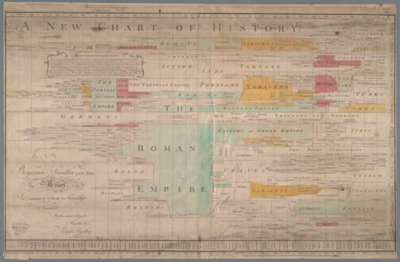 (Figure 1. Joseph Priestley’s A New Chart of History (1769), which regularizes the distribution of dates and orients the axis of time horizontally.)
These features are now so familiar as to seem beneath our notice. But in the eighteenth century, a horizontal axis with evenly distributed dates was revolutionary. So how did historians organize and understand time before the timeline? This question occupies the first three chapters of Cartographies of Time, which romp through the prehistory of the timeline, from early Christian chronicles and genealogies to Renaissance cartographies. We encounter historical moments figured across bears or dragons (with events carefully mapped to appropriate body parts as aide-memoires), time overlaid on geographical maps, histories traced over trees, streams, and building facades, and events chronicled in tables and matrices so elaborate that the introduction of the index was hailed as a major development. In each case, temporal representation depended on spatial metaphors. But these spatial metaphors were not standardized graphically; that is, space and time were not yet united in a visually intuitive way.
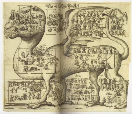 (Figure 2. Johannes Buno’s 1672 universal history, which locates events anatomically on the body of a dragon.)
Why not? This question lies at the heart of Cartographies, and though it’s difficult to answer fully, Rosenberg and Grafton offer fascinating suggestions. It’s clear that Priestley’s drive to grasp information in aggregate marks a sea change in how humans perceived time; rather than cataloging a series of discrete moments, Priestley mapped time as continuous, uniform, and irreversible. One driver for this change is secularization: in a pre-modern world, centered by the birth, death, and predicted second coming of Christ, it’s hard to regard all historical moments as equivalent. But this explanation is only partial. Priestley himself thought homogeneous representations of time would reveal God in the world, rendering visible a divine order previously unrecorded.
Perhaps even more pertinent, then, is a shift in how readers approached historical information; increasingly over the eighteenth and early nineteenth centuries, readers hoped for revelation from graphics, or, to put it another way, to uncover patterns and trends by reading history. As a result, regularized representations of chronology—rather than dragons, trees, streams, or tables—grew increasingly meaningful as ways of understanding and recalling history. As Priestley’s contemporary and fellow innovator William Playfair put it, “a man who has carefully investigated a printed table, finds, when done, that he has only a very faint and partial idea of what he has read; and that like a figure imprinted on sand, is soon totally erased and defaced.” While earlier methods (like the family tree) persisted as ways of understanding time, they were influenced by the “equi-secular” timeline introduced by Priestley.
The emergence of the timeline enabled increasingly technical and inventive visualizations of time, including Florence Nightingale’s groundbreaking charts of causes of death during the Crimean War and Charles Joseph Minard’s chart of troop strength in Napoleon’s army during his invasion of Russia (fig. 3). Both Nightingale and Minard made historical causes newly legible through graphics. Nightingale showed that disease and infection caused more British deaths than battle, while Minard dramatized the dwindling of Napoleon’s troops as they faced Russia’s brutal winter.
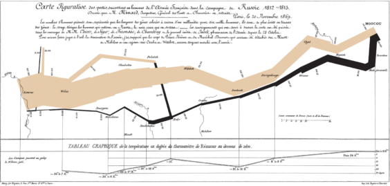 (Figure 3. Charles Joseph Minard’s map of Napoleon’s Russian campaign of 1812)
Priestley’s timeline enabled this kind of historical reasoning. But it also revealed profound difficulties in charting history, which both Nightingale and Minard confronted even as they deployed Priestley’s new method. Since the nineteenth century, a growing awareness of deep geologic time, evolutionary history, and the history of the universe have challenged the human desire to see all of history at a glance. Ray Kurzweil’s recent “Countdown to Singularity” (fig. 4) depicts exactly such difficulties, by using a logarithmic scale to chart all of human history—even our future—from the dawn of life to the moment at which artificial intelligence surpasses that of humans.
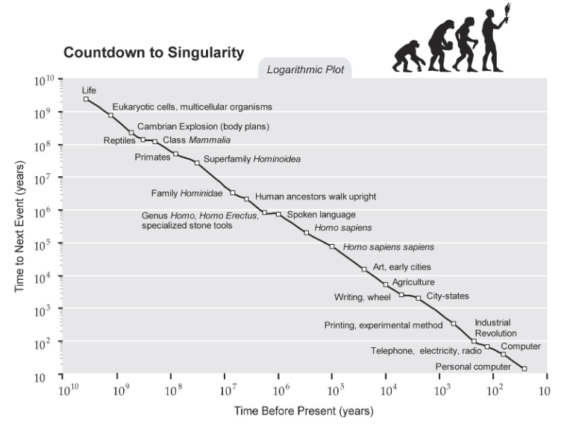 (Figure 4. Ray Kurzweil’s “Countdown to Singularity”)
In tracing these, and other, consequences of Priestley’s innovation, Cartographies chronicles the long history of riffs and reflections on the timeline, revealing at once the form’s flexibility and its limitations. Laurence Sterne’s novel Tristram Shandy, for example, figures the timeline as “morally impossible,” diagramming narrative time in the novel as jagged and loopy, rather than linear (fig. 5). As Sterne points out, the shape of the timeline tends to exclude narrative digressions, diversions, and qualifications. In other words, time is more complicated than linear representations might suggest. Indeed, the history of how the timeline has been bent—through scale, curvature, or plots like Minard’s of the relations between synchronous events—is the signal achievement of Cartographies, which reveals both what the new form afforded and how ingeniously it could be adapted.
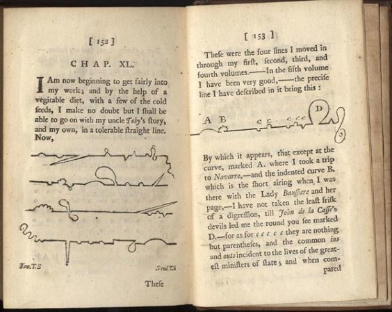 (Figure 5. Chapter XL of Tristram Shandy)
Cartographies of Time joins a cadre of infographics books beautiful enough to earn a spot on the coffee table. Paramount among them, Edward R. Tufte’s now-classic books Envisioning Information (1990), Visual Explanations (1997), The Visual Display of Quantitative Information (1983), and Beautiful Evidence (2006) tell a broader story of how information of all kinds has been visualized through human history. Other such works include John Bender and Michael Marrinan’s The Culture of Diagram (2010). Rifling through Cartographies of Time allows for fascinating forays into graphical techniques of all kinds, just as Tufte, Bender, and Marrinan’s books do.
And yet Cartographies of Time stakes out new territory with a productively narrow point of focus, paired with a broad historical range. By focusing on how we visualize time, Rosenberg and Grafton pose fascinating questions about human experience, the nature of time, and how our attempts to grasp it have changed over the centuries. Narrow enough in topic for casual reading, deep enough for serious contemplation, Cartographies of Time deserves endless—and by no means strictly linear—dallying. It is worth picking up and putting down, moving through backward and forward, opening up in the middle, and reading straight through. However loopy your course through Cartographies, your time perusing will be time well spent.
Margaret Kolb got her PhD in English from UC Berkeley. She is working on a book analyzing the history of probability, both mathematical and literary.


click to see who
MAKE Magazine Publisher MAKE Literary Productions Managing Editor Chamandeep Bains Assistant Managing Editor and Web Editor Kenneth Guay Fiction Editor Kamilah Foreman Nonfiction Editor Jessica Anne Poetry Editor Joel Craig Intercambio Poetry Editor Daniel Borzutzky Intercambio Prose Editor Brenda Lozano Latin American Art Portfolio Editor Alejandro Almanza Pereda Reviews Editor Mark Molloy Portfolio Art Editor Sarah Kramer Creative Director Joshua Hauth, Hauthwares Webmaster Johnathan Crawford Proofreader/Copy Editor Sarah Kramer Associate Fiction Editors LC Fiore, Jim Kourlas, Kerstin Schaars Contributing Editors Kyle Beachy, Steffi Drewes, Katie Geha, Kathleen Rooney Social Media Coordinator Jennifer De Poorter
MAKE Literary Productions, NFP Co-directors, Sarah Dodson and Joel Craig